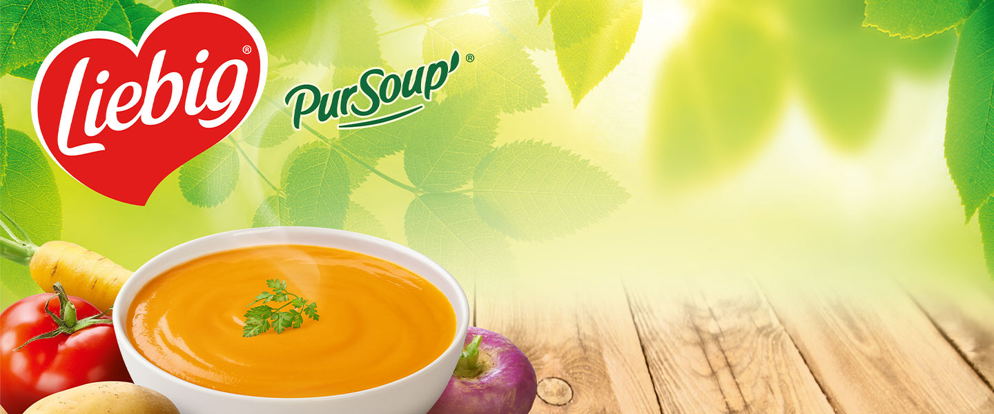
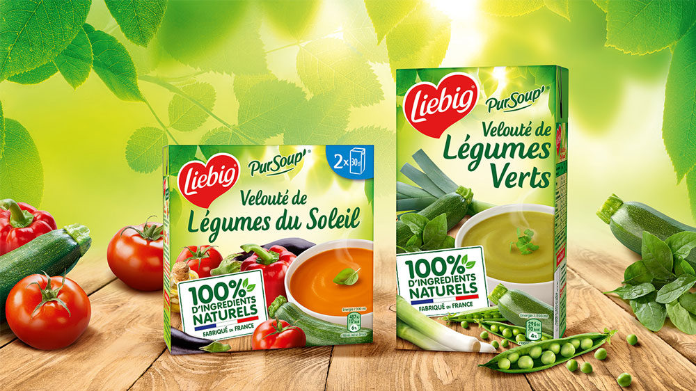
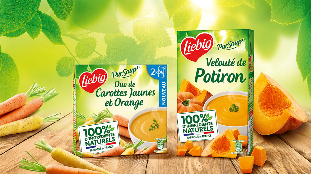
Following a structural decline in the soup market in the ambient department, and changing trends in the food industry, Liebig, a major player in the market, is looking to revamp the graphic identity of its historic PUR SOUP’ range to make it more natural, while at the same time reworking its recipes to keep only the best vegetables!
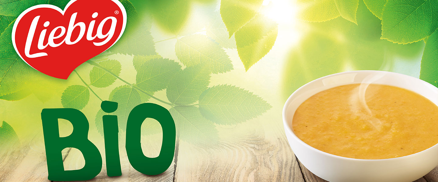
In a fast-growing organic market, Liebig, a key brand in the soup department, is looking to relaunch its organic range, which is making little headway, by modifying its entire product mix and offering innovative new recipes.
/ Challenge
How can we be more in line with new consumer trends and thus demonstrate greater naturalness, while maintaining our brand codes and impact on the shelf ?
How can we raise the profile of the Pur Soup’ daughter brand and its commitments in order to recruit new consumers ?
As a leader on the shelf, how can we regain control of organic soups, and what territory should we explore ?
How can we enhance the offer and legitimize the brand within the category ?
/ Notre réponse
More naturalness through the reworking of the brand’s foliage.
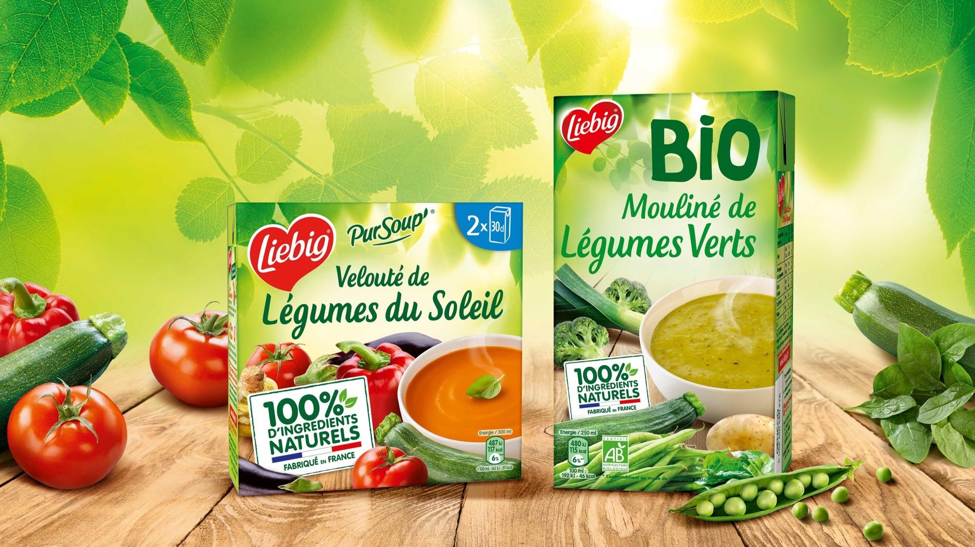
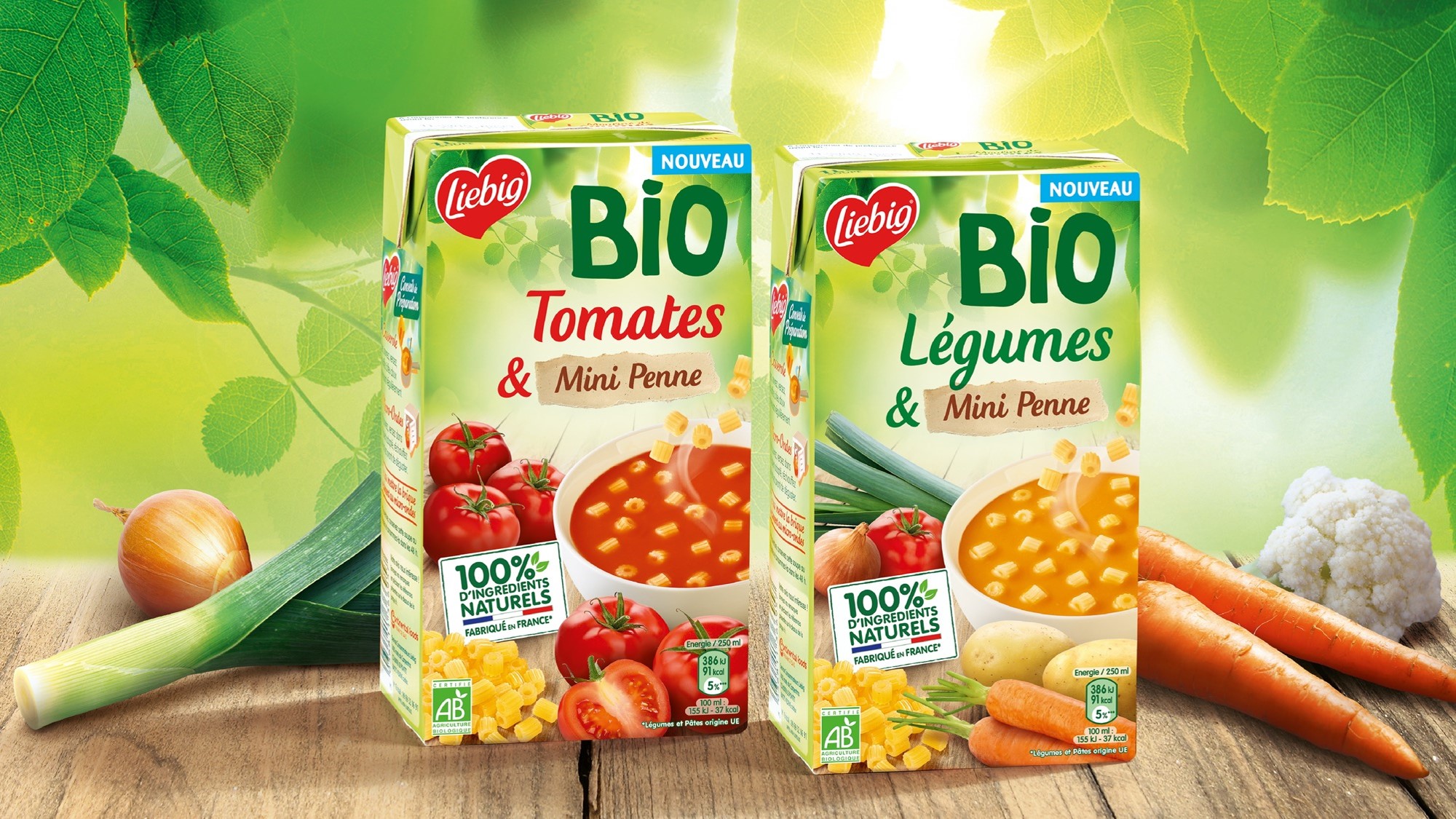
A more generous composition of ingredients, highlighted at the front of the pack (no colorants, no preservatives, no flavor enhancers, and 1 bowl equivalent to a portion of vegetables).
New, more natural lighting.
Bring more modernity to the brand by reworking the luminous halo surrounding it.
Highlighted the brand’s commitment by creating a sign listing its commitments and highlighting French manufacturing.
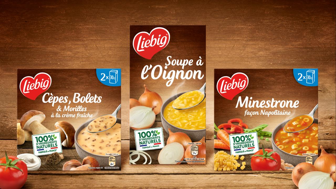
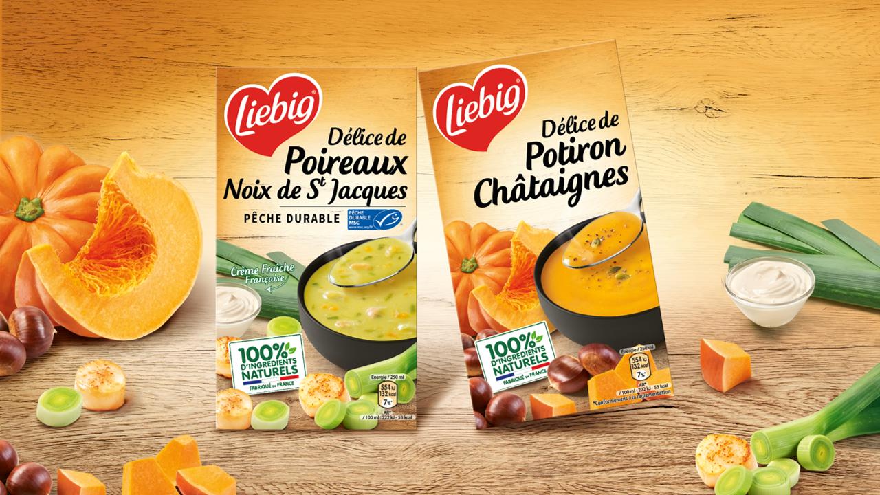
Capitalize on the strong Liebig soup identity codes that have made the brand so successful.
Establish a true ORGANIC identity that can nourish Liebig.
Enhance product uniqueness by relying on the naturalness of its ingredients: truer, more raw.