DEMAK’UP

/ Contexte

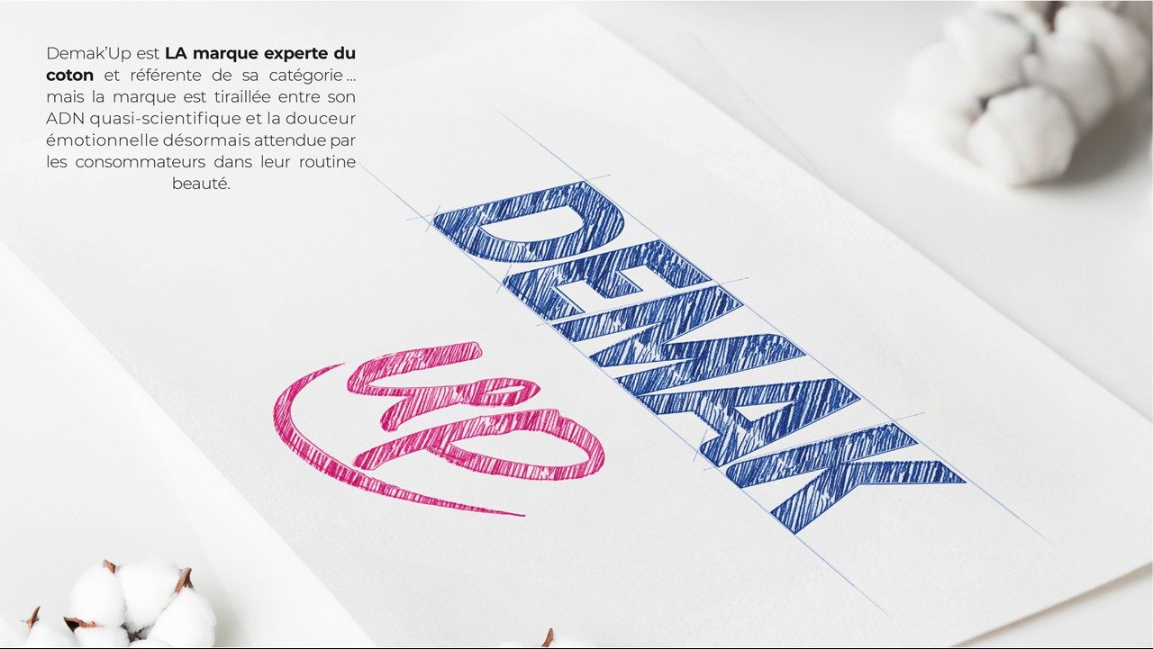
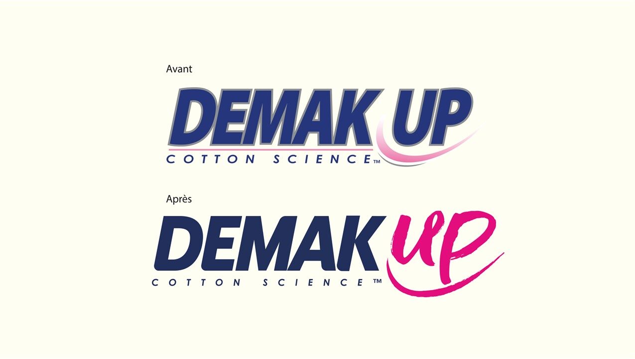
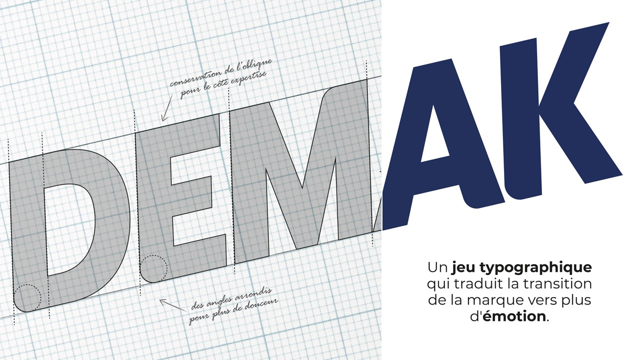
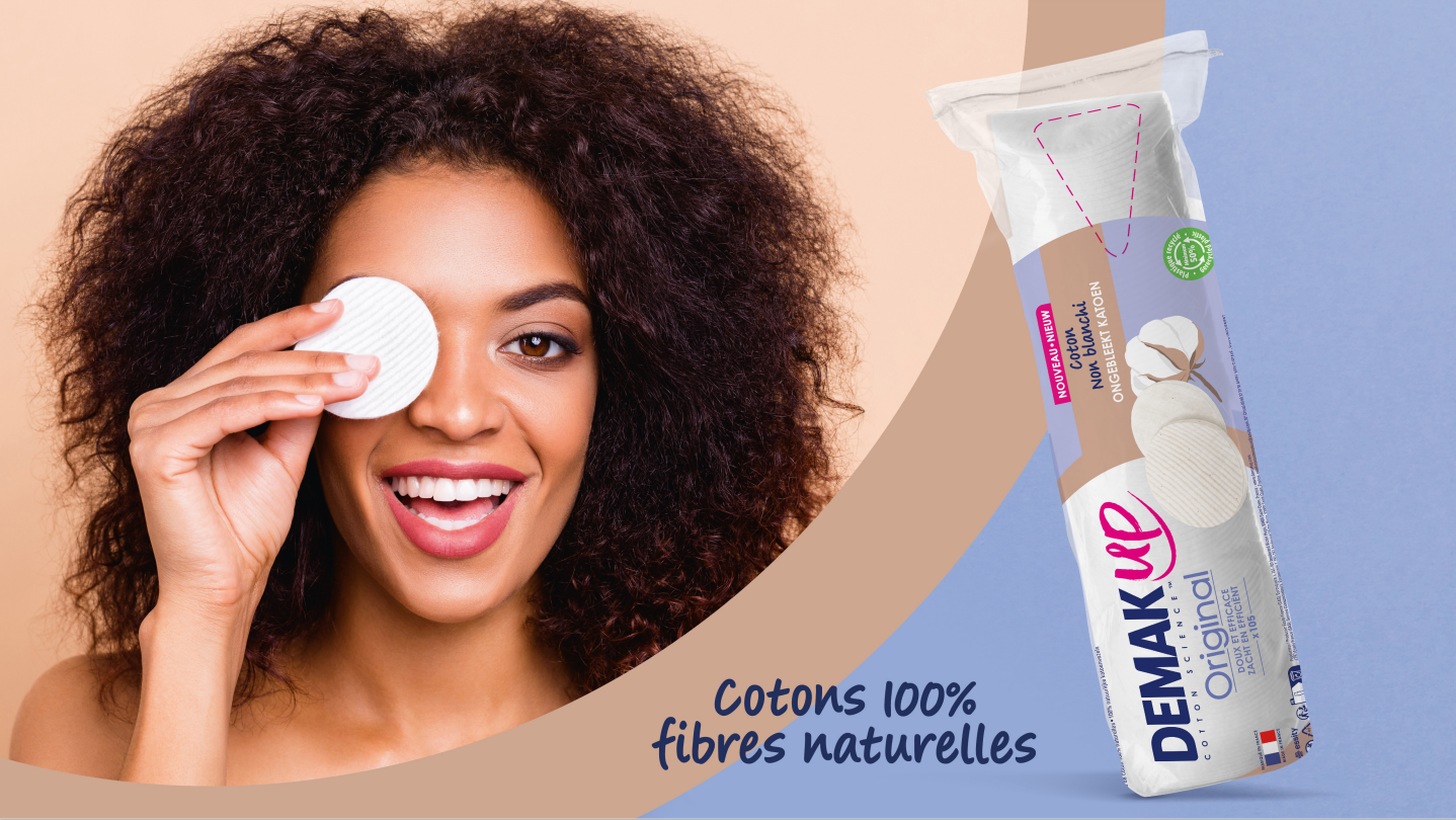
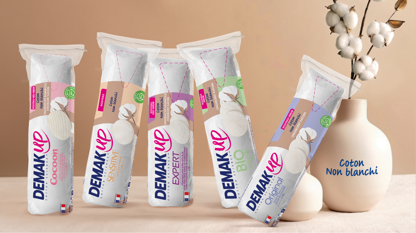
Demak’Up, the cotton expert, is the market leader in its category. Recognised for its expertise, the brand was keen to add an emotional touch to its brand universe by positioning itself in the skincare and beauty segment. As part of the rebranding, SUB was briefed to rework the brand’s overall graphic identity.

/ Challenge

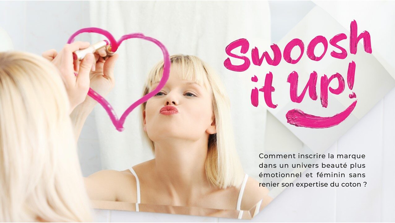
To position the brand in a more emotional, feminine beauty universe while retaining its cotton expertise.

/ Notre réponse

  • Develop a new logo and a new, more feminine and contemporary brand narrative. The new identity has a more ‘up close and personal’ feel, with the “Up” in a handwritten font as if written in lipstick.
  • Develop a strong brand-wide structure based on the symbol of the curve to highlight the iconic shape of Demak’Up cotton pads and lend a touch of softness.
  • Design a more natural, sensory-oriented graphic universe reflecting the product benefits to make the product lines more distinguishable from each other.

Projet

Secteurs

Client

DEMAK’UP

Réalisation

2024

Services

OTHERS WORKS

Ensemble, transformons
vos défis en opportunités !

autres réalisations

Monnaie de Paris x Lacoste

RESTONS CONNECTÉ RESTONS CONNECTÉ

S'inscrire à
la Newsletter

Ne manquez aucune de nos actualités et inspirations !