/ Contexte
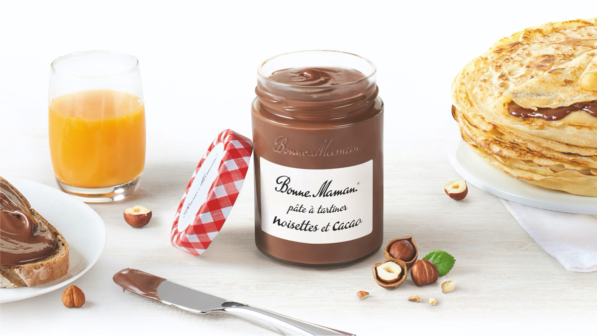
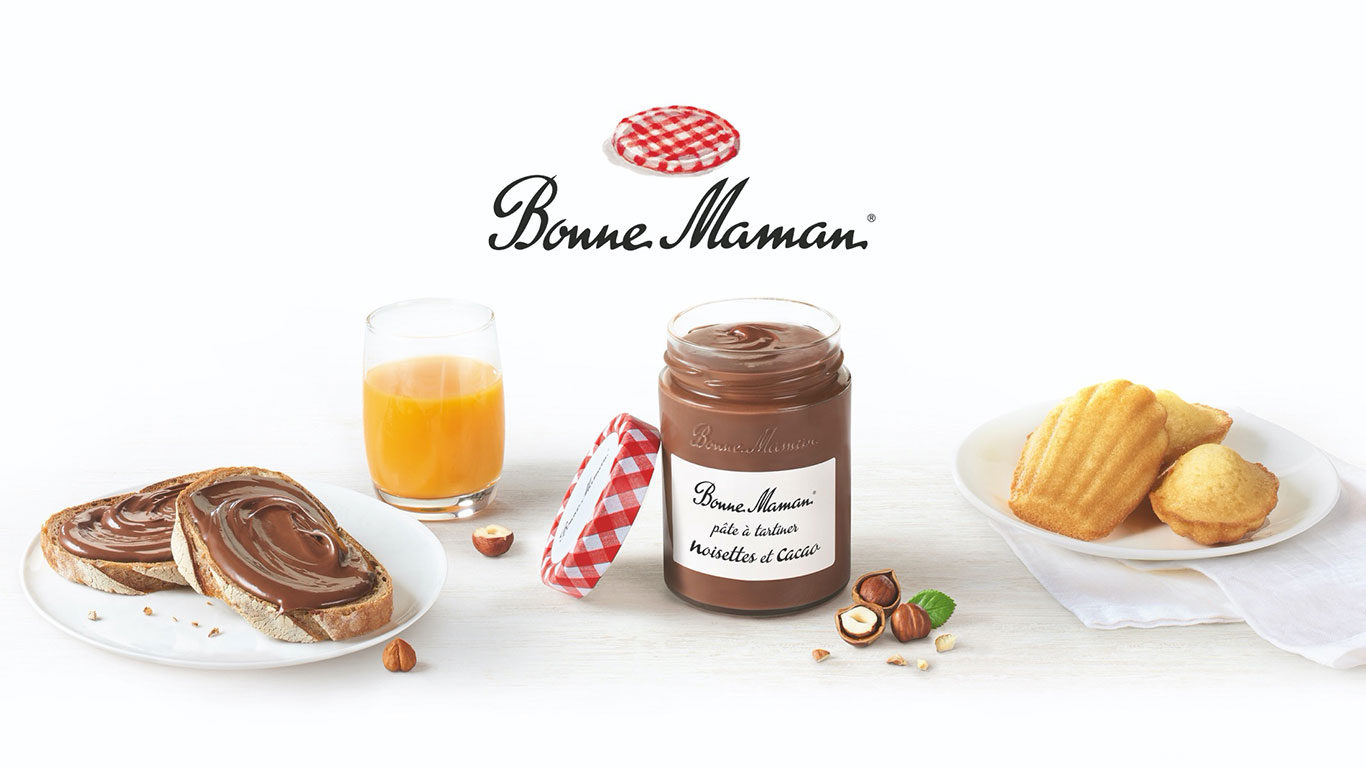
Bonne Maman wanted to offer both children and adults a delicious treat to enjoy at every special moment of the day: their spread. This new indulgence aligns with the brand’s values and desire to bring joy, featuring 20% hazelnuts, no palm oil, and made in France!
Despite a saturated market, it seemed logical for Bonne Maman to carve out its place in this space to expand its range of spreads. We supported them in creating the jars and activation visuals.
/ Challenge
How can you develop a new product line that isn’t directly related to your core expertise?
How can you establish the brand’s DNA and codes in a new segment that is already well-established?
/ Notre réponse
Support on the packaging to achieve a more premium feel, inspired by the codes of fine grocery stores: a rounder and more slender jar.
To create greater differentiation on the shelf, we stepped outside the category by emphasizing the brand’s codes: a label similar to the jams (Bonne Maman’s expertise) and highlighting the gingham pattern, a fundamental element of the brand.